

Sketching Thoughts: The Empire Of Signs
Too many signs result in waywardness, finds Fabio Filippini.
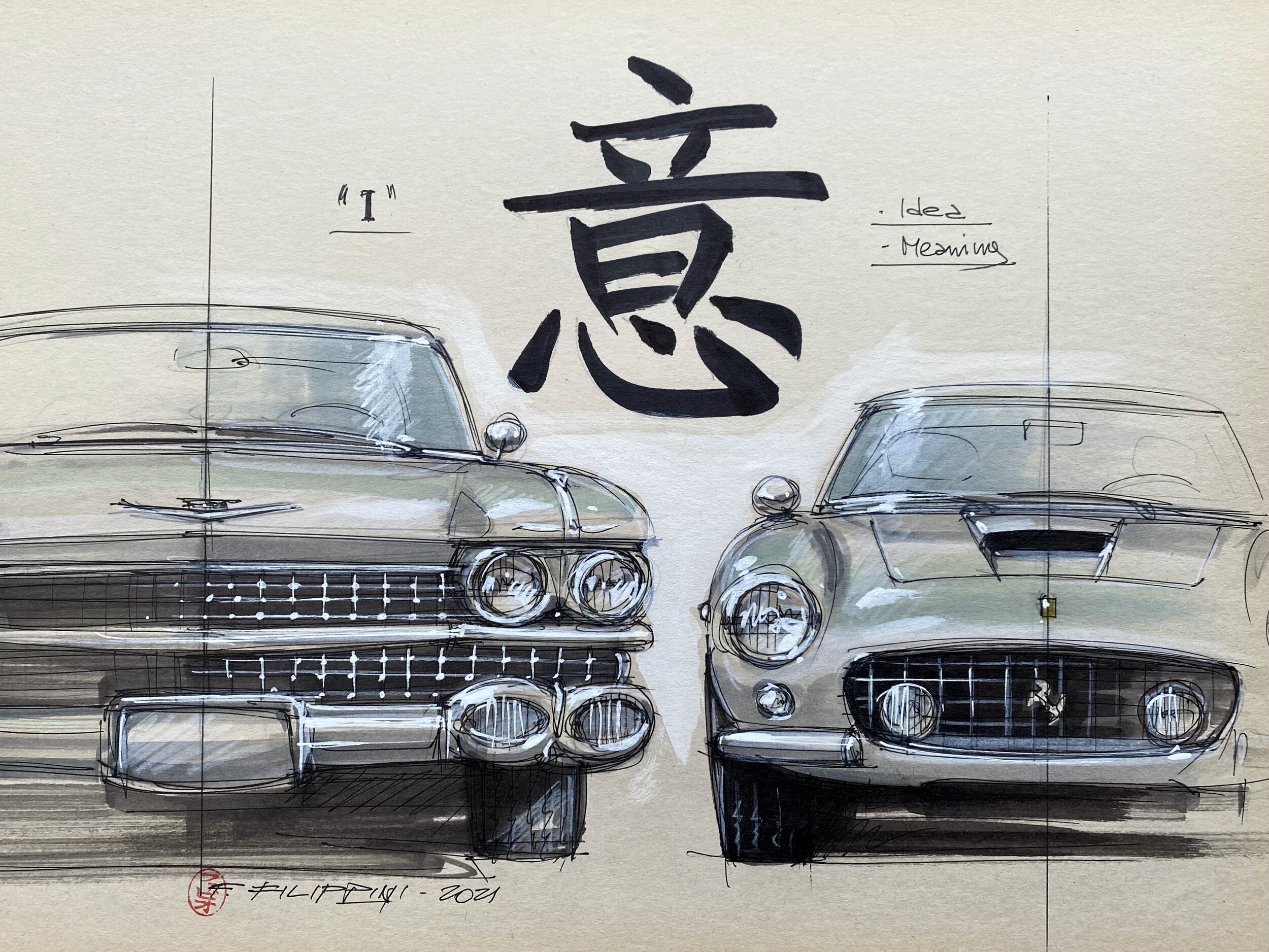
Superficial symbolism vs functional reality ( photo © Fabio Filippini)
The Empire of Signs is an essay by Roland Barthes from 1970, about the great semiologist’s attempts at penetrating Japanese culture through the ‘signs’ present in its writing and everyday life aspects. Apart from Barthes, anyone who has ever experienced a stroll through Tokyo’s Shibuya or Shinjuku neighbourhoods has probably been overwhelmed by the overflowing and ubiquitous signs and messages, which remain incomprehensible to the western traveler. You might remember Bill Murray being lost in translation - that’s what it feels like.
It is precisely from the contrast between the overload of signs and the total absence of meaning that a certain discomfort can arise for the observer unable to decipher them. This feeling, for different reasons, could also be perceived in today's car design - the only difference being that the contrast comes not from the inability to read the sign’s meaning, but more likely from the absence of it.

Do you see the signs? (photo © Shutterstock)
Car design has always expressed itself through volumes, shapes and, indeed, ‘signs’, thus integrating contents of different origins: technical, industrial, functional and imaginary. These are filtered through the language of culture and values of each particular brand. In the automobile’s nascency, these signs, initially acting as references to carriages, progressively emancipated themselves by creating a specific language for this global product. During the ‘roaring’ ‘30s, automotive symbolism employed chrome and decorative elements to express the enthusiasm of the unbridled developments underway, as is particularly evident in the great American and European luxury cars. This expression reached its peak with the exuberant, Art Déco-inspired bodywork of the Grande Carrosserie Française.
After WW II, the economic and social recovery was guided by far more pragmatic and profound aspects - at least in Europe, where car design began to express itself through pure volumes that were strongly evocative of their respective function: masterpieces such as the Cisitalia 202, the Citroën DS and the BMC Mini are the clearest demonstration of this development. Meanwhile in America (which had been far less affected by the conflict on its home soil), the automobile continued to expand on its previous symbolism through the increasingly emphatic signs of the 1950s-60s American styling. Comparing the front grille of a Cadillac or similar to that of a contemporary European car should hence suffice to understand the difference between superficial symbolism and functional reality. In the first case, we are dealing with false signs that exasperate the imagination. In the second case, we are presented with grids or simple aluminium lamellas that perfectly perform two contrasting functions: air permeability and impermeability to foreign bodies. Look at a Ferrari 250 GT SWB for example, which is pure in every respect: proportions, form and function, without anything added on top. This is precisely the difference between styling and design. And also between ephemeral futility and permanence.
In the automobile’s case, this craft has been called styling for a long time. Only towards the end of ’60s did the notion of design begin to receive consideration, in the sense of a deeper integration of all the object’s conception factors, alongside an expression of its values and contents. Functional and safety issues started influencing the signs of the automobile, in parallel with the transformations of the global automotive industry. This was probably prevailed until the end of the 20th century. Then things changed again, and are still evolving today. For by the ‘90s already, superficial semantic expressions began to take precedence over content. In this context, we mustn’t forget the likes of Flame Surfacing, New Edge design and what not, which contributed immensely to the shift of the design discussion almost exclusively towards superficial aspects.
Whilst the designer, as he leaves the perimeter of the standalone product, now needs to deal with more intangible factors, the playground itself has expanded further, subjected to new, decisive influences, both in the technical and cultural fields.

Quantity of signs (photo © Audi AG)
On the one hand, there has been a progressive technical homologation, driven by industrial and economic needs. On the other hand, increasingly stringent international standards have been added to the list of requirements. Furthermore, there is an ever-increasing preponderance of emerging markets’ expectations, which now dominate style trends worldwide. Recent designs of German premium brands betray how important the expectations of Asian customers in general and the Chinese in particular are to these companies. After decades of Asian copies of German design, it seems as though the automotive design world has been turned on its head.
Obviously, the ‘blame’ for this development is not solely to be put on those customers and their alleged taste. In fact, it seems more likely a consequence of designers’ interpretations of those alleged preferences, driven by the excessive influence of marketing criteria. Moreover, a significant generational and cultural change is taking place at all OEMs’ design centres, which has considerable impact on the very notion of design (and maybe on taste too). However, the actual problem also stems from the vision of design management and their ability (or lack thereof) to propose meaningful guidelines to their teams, rather than adopting corporate routines and politics as an easier option. Furthermore, the most recent generations of automotive designers have indiscriminately undergone standardised training and feed their creativity through the same global information channels. A logical consequence of which is the emergence of a worldwide conformist design mainstream. Against this backdrop, it is easy to understand why these are confusing times for automotive design.

Quality of signs (photo © Audi AG)
As we no longer find a large scope of variety among the stylistic languages of most brands, the tired phrase about «cars looking all the same» has never made as much sense as it does today - despite there never having been as great a variety of segments and technologies on the market. Yet, with the uncontrolled profusion of front grilles as immense as they are functionally useless (allegedly inspired by Chinese theatre masks or the Transformer aesthetic), the addition of brightwork by the shovelful, fake exhausts commonly adopted by everybody (whose application on some EVs seems to be only a matter of time) and an increasingly significant amount of complicated details, today's cars have turned into accumulations of signs devoid of content. They have become superficial caricatures, often bearing no relationship with the very meaning of their respective brands and the cultures that produced them.
As with disorientation due to Japanese signs, recent cars, and in particular those of the SUV, luxury saloon or super sports car categories, are the obvious representation of how the progressive loss of sense and meaning relating to these products and the automobile in general is unsuccessfully compensated by the compulsive addition of superficial symbols. For these only render the underlying message even less understandable, thus producing conformist objects overloaded with signs, but completely devoid of content.

Say Anything ( photo © Zhiji Auto)
Paradoxically, the opposite of this phenomenon also occurs, as in the case of the countless EVs, whose tortured and complex forms converge in an unexpressive void at the front, in lieu of the entirely decorative grille. So, on the one hand we have grimaces screaming out loudly without any meaning, and on the other mute expressions that have not yet found a way to symbolise their contents.
Even in interior design, one could reflect on the excessive presence of unnecessary and superficial signs. Just a few days ago, on Facebook, someone posted the following joke: «If exterior designers did the interiors, then all the vents would be fake.» Jokes aside, what do we say about the gigantic screens that are now completely invading the dashboards of every new EV? Maybe those really are the equivalent of Shibuya Scramble Crossing, albeit inside a car. Another sign of our confusing times.
