

Sketching Thoughts: «Go Back To The Sketch!»
Capturing the visceral essence of a design is as hard as it is important, finds Fabio Filippini
Direction matters ( photo © Fabio Filippini)
One of the most common phrases spoken during project reviews at any given car design studio is «go back to the sketch!».
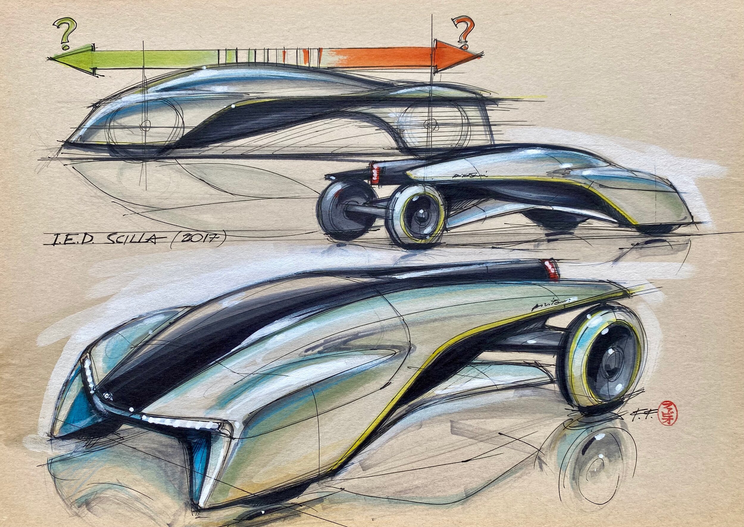
I still vividly remember a presentation at the European Institute of Design (IED) in Turin a few years ago. Pininfarina was sponsoring the college students’ thesis project that year. Three collaborators of mine, who had gone to the presentation ahead of me, had already identified the theme to be selected, among an enormous amount of drawings hanging on the walls. Together with the teachers, their choice fell on a small freehand drawing that clearly stood out amidst many huge renderings of higher graphic quality. I wasn’t told anything upon my arrival, however, as my colleagues let me observe each and every piece of work on show, in order to allow me to form my own, spontaneous opinion. As expected, I immediately stopped in front of that same drawing and chose it without any hesitation, asking the students to go back and, indeed, start over on the basis of that sketch.
The expressive power of those few lines was evident to all of us, to the point that it surpassed the most detailed drawings and subsequent digital renderings of the same proposal. Even more surprisingly, we eventually realised that we all had imagined this very futuristic and abstract concept, expressed in those few pencil lines, to be travelling in the opposite direction to that intended by its creator- thus the Scilla project was developed, which was later presented at the Geneva Motor Show in 2017 by the students of the IED and Quattroruote magazine.

Two more dimensions, same essence ( photo © IED)
I have already written about the importance of drawing, and in particular of the initial sketches, where the original idea is expressed spontaneously, in its most evident essence. It is precisely in those freehand sketches that the clearest theme and the most successful proportions could be perceived, allowing one to glimpse and imagine the shape of the car one wants to design. Above all else, this is a question of lines and accelerations of the curves, as created by the strokes of the hand, but also of how the various elements are proportioned - which typically is in somewhat exaggerated a fashion in those initial sketches, in order to explicitly express the desired character.
Of course, sometimes those features can be excessively caricatured, with ridiculously huge wheels and very small cockpits. These childish ‘tricks’, employed and exploited by too many an inexperienced designer, typically act as decoy from a certain paucity of ideas, inevitably resulting in disappointment with the real proportions of the final object. However, if one consciously avoids lapses into such superficial stratagems, the initial sketch generally represents the ideal synthesis of the overall theme, which ought to be followed throughout the design development process of any given project. Which admittedly is easier said than done…
Indeed, during the development of more detailed renderings or virtual and physical models, when technical constraints and real dimensions are taken into account, the strong vision of the initial sketch is destined to get diluted or lost altogether. These transition points from one phase of the project to another are among the most critical moments in the creative process of automotive design, as this is when inexperience and lack of clarity on the designer’s (or management’s) part can result in the final goal getting completely lost. Accordingly, ensuring the continuity and permanence of the selected original theme is certainly one of the key elements of success for a design project. And it is precisely for this reason that designers are regularly asked to «go back to the initial sketch».
The value of that initial sketch is utterly dependent upon the designers’ ability to identify that rough design’s salient features. This is by no means an easy exercise, which is why hardly everyone is able to grasp those features with precision, in order to make a clear and essential synthesis. This issue starts with the author of the sketch, who can be confused by the set of ideas and themes intended to be expressed. The creator can indeed turn out to be unable to understand the priorities of his or her work.
Sometimes, as mentioned before, this is just a matter of a few lines or shades, perhaps even just of an acceleration point on the line, which might be particularly well-positioned within the balance of the design in its entirety. During subsequent development, this original balance and tension can be lost. A systematic approach, aimed at keeping the same geometric position of the themes identified in the sketch, provides no solution to this issue. In fact, by changing the proportions or even just the overall dimensions, the perception of the shape also changes. This happens even more clearly during the transition from drawings to the 3D model, sometimes making it essential to intentionally move the relative position of the various elements, in order to correct the ‘trend’ of the lines and recreate the same original ‘tension’ and dynamic balance, despite the design in its entirety being modified.


One sketch, two interpretations (photos © Jaguar)
This process can result in the creation of a shape that, while obsessively integrating all the elements of the original sketch, totally betrays its spirit, hence transforming into some sort of deformed duplicate. By contrast, some parts may also be eliminated or consciously modified in order to capture and replicate the exact spirit and perception provided by the initial sketch. This second approach I can recommend on the basis of personal experience, having intentionally transformed parts of the design during the development of some projects, precisely for the purpose of obtaining the initial expression in undiluted form. The success of this method was confirmed by external observers, who wouldn’t even notice the changes from the original drawing.
Being able to understand the uselessness of certain details and knowing how to select only the fundamental ones for the purpose of maintaining the main theme is an important and difficult lesson. A lesson best learned through experience.
In his Architectures series of photographs created at the end of the ‘90s, Hiroshi Sugimoto, a renowned contemporary Japanese artist and photographer, portrayed great masterpieces of Modern Architecture through the intentionally out-of-focus effect of his camera lens. The resulting images, completely blurry, made the salient features of those famous monuments even more evident and reinforced their character. By eliminating unnecessary details, the images expressed the buildings’ purest essence in a clear and evident way. A sort of philosophical paradox, in which the intentional lack of sharpness and precision makes the profound reality of things more visible.

Lending focus through fuzziness ( photo © Shutterstock)
In some way, this is an exercise that can also be repeated in the field of automotive design - by observing a drawing or a model with half-closed eyes, to try to analyse only its fundamental elements and proportions; those salient features must be maintained throughout the subsequent development of the project, in order to ensure the desired final result corresponding, in spirit and form, to the original sketch.
If by then you really can't grasp those salient features, you might better throw away the sketch already… and start again from scratch.

Related Articles


Car interior designer who created some of the most significant cabins of all time, most notably the Porsche 928’s